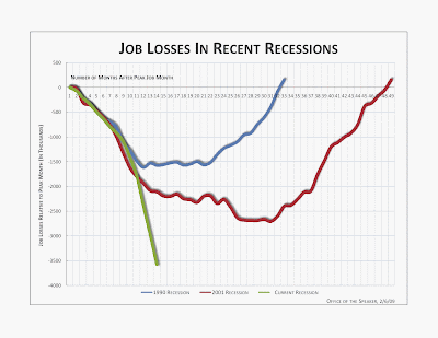
Notice the differences: the change in the direction of the Y axis, lengthening the X-Axis, and the reduction of lines. One could argue that this clarifies the information by representing growth as positive and job loss as negative, and reducing the noise to the only those comparisons of relevant to the audience.
Someone trying to emphasize a different point or promote a different message might have made different choices in how they displayed the data.
Is understanding lost or gained by only including the most contemporary recessions?
No comments:
Post a Comment