Similarly, in making comparisons between different recessions(economic states) we need to ask whether adjusting for time-- (or perhaps even job-value as it contributes to the GDP. Maybe a significant percentage of jobs lost now, are fundamentally different than in recessions-past?) --would present a more accurate, valid, and as Suzie poses - better understanding of this particularly focused view of the world.
Tuesday, February 17, 2009
Graph A Re-revisited
Suzie poses the question of whether or not this graphic is more meaningful with only recent data being plotted. But I find this graphic painting a quite clear picture: things are worse now and on a worse trajectory than in other recessions. But what is unclear is what the Y-axis truly represents. The data show absolute values (#s of jobs lost) but relative to a peak value. Without the viewer knowing (asking or being told [in defense of the Speaker maybe this is explained overtly elsewhere]) do we know what this peak is, how its value was is derived- what role does it play in framing the viewer's perspective.

Graph A Revisited
Here is another presentation of the same employment statistics. It uses the same data set but was put together by Pelosi's Office of the Speaker. (Click image for Big)
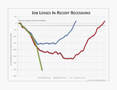
Notice the differences: the change in the direction of the Y axis, lengthening the X-Axis, and the reduction of lines. One could argue that this clarifies the information by representing growth as positive and job loss as negative, and reducing the noise to the only those comparisons of relevant to the audience.
Someone trying to emphasize a different point or promote a different message might have made different choices in how they displayed the data.
Is understanding lost or gained by only including the most contemporary recessions?

Notice the differences: the change in the direction of the Y axis, lengthening the X-Axis, and the reduction of lines. One could argue that this clarifies the information by representing growth as positive and job loss as negative, and reducing the noise to the only those comparisons of relevant to the audience.
Someone trying to emphasize a different point or promote a different message might have made different choices in how they displayed the data.
Is understanding lost or gained by only including the most contemporary recessions?
Monday, February 16, 2009
Graph A
 Here is a line graph with non-linear time lines. The current time line is highlighted by an additional color. The light grid in the background helps the user quickly locate the context.
Sources: Bureau of Labor Statistics
The Bureau of Labor Statistics provides data in text files. How often do they publish?
Subscribe to:
Posts (Atom)