This is a beautiful graph representing population growth in cities over time. Notice how the cities are arranged by their geographical location so that you get a sense of the migration of populations.
Numbers, graphs, and charts.
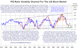
 This graph feels insane. There is a tremendous amount going on that I can't understand. Nor do I want to understand, really. Intuitively I don't trust a graph like this. The text isn't clear. The Y-Axis is spread logarithmically. It feels like the conclusion has been drawn, and then the graph has been made to fit the conclusion. I can't speak intelligently about the subject matter and why they are doing what they are doing. Suzy? Jordan? Whats the deal with the Y-Axis?

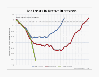
 Here is a line graph with non-linear time lines. The current time line is highlighted by an additional color. The light grid in the background helps the user quickly locate the context.