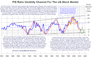
 This graph feels insane. There is a tremendous amount going on that I can't understand. Nor do I want to understand, really. Intuitively I don't trust a graph like this. The text isn't clear. The Y-Axis is spread logarithmically. It feels like the conclusion has been drawn, and then the graph has been made to fit the conclusion. I can't speak intelligently about the subject matter and why they are doing what they are doing. Suzy? Jordan? Whats the deal with the Y-Axis?
Tuesday, February 17, 2009
 This graph feels insane. There is a tremendous amount going on that I can't understand. Nor do I want to understand, really. Intuitively I don't trust a graph like this. The text isn't clear. The Y-Axis is spread logarithmically. It feels like the conclusion has been drawn, and then the graph has been made to fit the conclusion. I can't speak intelligently about the subject matter and why they are doing what they are doing. Suzy? Jordan? Whats the deal with the Y-Axis?
Subscribe to:
Post Comments (Atom)
The Y-axis is logarithmic (the scale is base 2) The axis is scaled as such in order to show a trend: the two black lines, upper and lower, which is clearly on the rise- which is ultimately the take away message of this chart. On a continuous scale the trend may not have been as easily detected and the inference of increase more difficult to make.
ReplyDeleteJordan
(in case it was unclear- the increase is exponential; and this would be more difficult to see on a normal 1,2,3,4,etc... scale)
ReplyDeleteJDA
ok. I think I need to set up some examples where a graph's Y-Axis is and isn't logarithmic to understand the difference. I need to setup some exponential trend lines though? I need cheap decent graphing software.
ReplyDelete